Racunala.hr

Logo Design
Samurai as a symbol of "the one who serves". Računala.hr is there for its client and symbolically shows that. If we look closely, we will notice that the left side of the face is the letter "R" - Računala (Computers). The right side is a reflection of the left side, and together they form devotion and loyalty. Samurai's Mempo (protection in the area of the mouth) forms the processor - the lifeblood of work and progress. The colors we see are part of the brand's color palette.

II.
Flyer and Catalog Design
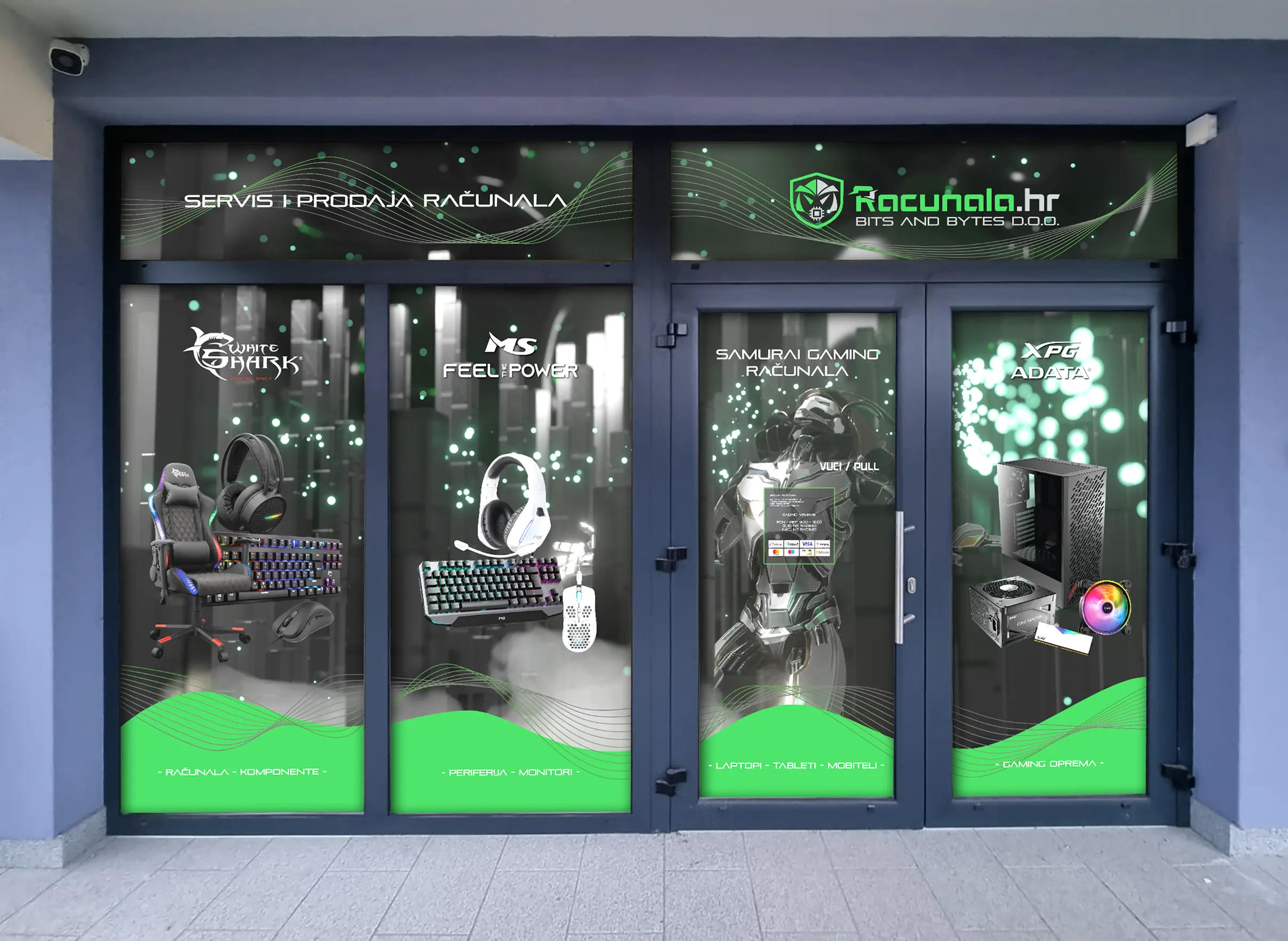
The two-sided design combines sales and PC repairs - services that racunala.hr offers to its clients. The green color, just like the logo, is the carrier of the brand's color palette and represents sales. Blue represents PC repairs.
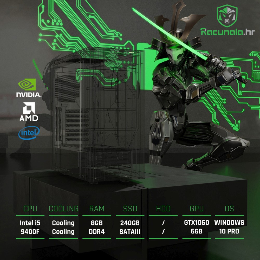
The design of the new product catalog, designed with special attention to detail, followed four main steps - PRODUCT COLLECTION in agreement with the client, DESIGN itself, respecting the client's wishes, but also taking care of the brand, SCHEDULE PLANNING, bearing in mind simplicity and clarity and QUALITY PHOTOS and creating a background that will unite everything into one representative whole.


III.
Web Shop Item Template
Green and dark gray colors predominate and symbolize power and clarity, determination. Light sources and reflections are incorporated into the whole so that it is easy for the client to insert a photo of the computer case, which will fit perfectly.


IV.
Web Design
We combine colors that blend into the whole and follow the story of the flyer. The two colors complement each other perfectly – blue and green, which is both primary and a symbol of sales. On the other hand, blue reappears as a symbol for PC repairs, one of the services offered by the client. An animation of a samurai appears on the front page, which emphasizes commitment, and was custom made for the client.

V.
Vehicle Wrap Design
We have created the design and print preparation for the official delivery vehicle. The green color, along with the mascot, crucial in the brand identity, dominates the design, emphasizing recognition and connection with the company.

Beauty Atelier Kriss
